
Why we need diacritical marks
Where did the diacritical marks come from? How come they are subject to linguistic and technological disputes? Why is it that we don’t use them correctly? And why do we need them?
On October 27, 2008, designer Cristian “Kit” Paul declared war on the misuse of Romanian diacritical marks in an article published on his personal blog. He had had enough of the ă written with caron or tilde instead of breve, of the ş and ţ written with cedilla instead of comma, of all the publications and television channels and designers that use them randomly, of the lack of any coherent standards and the lack of compliance where standards were set. Romania looked like a country of semiliterate people – even the ă in naţională (national) on the Romanian bills had a caron on its head.

A partner at Brandient, the most reputable branding agency in Romania, Kit speaks like a wise man who knows the world is not divided into black and white – surely not when it comes to diacritics. Yet, his article was meant to draw attention: it had to coverthe typographical errors of the past 20 years and have the force of a manifesto. So, besides information, he used persuasion: it’s better not to use diacritics at all than to use them at random. It’s the same with underwear – better none at all, than to wear them outside your pants.
Kit’s manifesto spread, became reference on foreign forums and continues to attract comments. It hasn’t lost its actuality and immediacy as it isn’t just hair-splitting done by stubborn designers – who sometimes go as far as criticizing the typography of funeral wreaths – but an important lesson on the need for conventions.
Writing, just like speaking, is based on conventions. Without conventions, it would miss its fundamental purpose: communication. It is just like waltzing: two people have to take part and coordinate; the music and the steps must follow a known pattern; a standard of correctness must be observed. If you just swing or sway, it means you swing or sway; it doesn’t mean you’re waltzing.
In Romanian written language, the diacritical marks are a basic orthographic norm. Five letters of the alphabet are assigned three glyphs to mark a different sound than that of the initial Latin letter. The norm became an impediment about two decades ago, when technology reorganized text production and brought about various options: diacritical marks completely left out, replaced with other letter combinations or simply replaced with other signs.
That’s how we ended up with some ambiguous Internet article titles: “Bulgari de vara! Turistii de la munte s-au distrat de parca ar fi iarna” (“Summer Bulgarians! Mountain tourists enjoyed themselves as if it were winter.” Had diacritics been used, the line would have read: „Summer snow balls! Mountain tourists enjoyed themselves as if it were winter.”)or “FMI a aprobat a doua transa pentru Romania” (“IMF approved the second trance for Romania.” Instead of “IMF approved the second installment for Romania”). Or sloppy signs such as: “Banca Romaneasca” (Written with the correct glyphs: “Banca Românească”- The Romanian Bank), and commercials announcing: “Plãteşti mai puţin primeşti mai mult” (TN: Written with the correct glyphs: “Plăteşti mai puţin primeşti mai mult” – Pay less get more) . The options built up to a real Babylon.

Of course, not everybody wants to, nor should, be a waltz champion. Kit knows that any reader understands that ă is ă, ş is ş and ţ is ţ regardless of the glyphs used and even if they are written a, s, t, sh or tz. What he meant to convey in his manifesto is that this relativism cannot be auspicious.
Designers are not the only ones affected.
Programmers, academics, they all try – once and for all – to put an end to a more than 200-year-old debate over the use and writing of diacritics.
The first war of the diacritical marks began during the second half of the 18th Century with the shift from the Cyrillic alphabet – introduced in the church books of the 10th – 12th Centuries – to the Latin alphabet. The first to have this initiative were Samuil Micu and Gheorghe Şincai, active figures of the Transylvanian School, which aimed at defining the identity of Romanians in Transylvania and proving their Latin origins. The idea, a very inspiring one socially and politically, was quickly adopted by scholars in Ţara Românească and Moldova.
Nonetheless, from a technical point of view, the adoption of the “ancestral letters” proved to be a difficult process. The Cyrillic writing system was well adapted to the language, each sound having its own graphic counterpart. The Latin alphabet left out some of the sounds in Romanian language. The problem was: we have a sound, how should we write it?
The solutions were divided between two opposing principles: the etymological and the phonetic. The war between the two sides – the “etymologists” (Latinists) and the “phonetists”– lasted for more than 100 years during which the Romanian scholars created more than 40 orthographic systems.
“The Latinists’ spelling would have saved us from the diacritical marks,” jokes Rodica Zafiu, Ph.D., head of the Romanian Language Department at University of Bucharest. The etymologists intended to make the origin of words as transparent as possible; the phonetists were aiming for a strict sound-letter relation. The phonetic principle relied on functionality: inventing new letters would have been uneconomical, whereas diacritical marks were very economic as they made use of something that already existed.
In 1780, Micu and Şincai proposed a strictly etymological spelling, very much resembling the original Latin words. Petru Maior went a step further and, in 1819, published a new orthography, reprinted in 1825 as an addendum to “Lexiconul de la Buda” (The Buda Lexicon), a work of reference in today’s orthographic disputes.
He suggested writing ă with the original vowels marked by an apostrophe, and î with the same vowels marked with a circumflex: mâni (tomorrow), vêntu (wind), gûtu (neck), ara’mu (brass), sa’ni’tate (health). Z, ţ and ş were to be written with d, t and s with a cedilla. Aron Pumnul, a scholar born in Bucovina, also chose the cedilla for z and ţ, but he proposed ă to be written with æ and î with i and circumflex accent.
The first certain standard was the official enforcement of the writing system with the Latin alphabet: in 1860 in the two united principalities and in 1862 in Transylvania. Nevertheless, the consensus over method was nowhere in reach.
The most renowned promoter of “etymologism” was Timotei Cipariu who published the most comprehensive orthography in 1866. He considered phonetism pure madness. Taking after his predecessors (Budai-Deleanu, Heliade Rădulescu), Cipariu argued in favor of the elimination of the words of Slavic, German, Hungarian and Turkish origin and their replacement with West Roman elements.
As for the differences in pronunciation between different regions, Cipariu believed they could be leveled through writing. To this end, a “regular usage” comparable to the language of scholars had to be created. “There is no such usage” replied Titu Maiorescu, and Al. Philippide gave him the final blow: “The language usage depends on the scholars’ consensus. Where’s our consensus? Or isn’t it that every writer writes as he pleases?”.
Indeed, every scholar developed an orthographic system according to his personal beliefs. In that, every system was as correct as any other. The same was true for the printing houses, which complied with the orthography particular to their specific area. Texts were written in transition alphabets, combining Cyrillic and Latin letters, and some contained inconsistencies from one page to another.
The most significant step toward order was made by Maiorescu. In 1866, with “Despre scrierea limbei române” (On the Writing of Romanian Language), he hoped to eliminate the confusion between “the etymologic, phonetic, phonetic-etymologic method, or whatever they are called. A method must be logical. We are not meant to make alphabets and graphic creations: we deal with the Latin alphabet.”
“The intellectual principle” of Maiorescu stated: sounds with a corresponding Latin letter are to be written with that letter regardless of the etymology. Ă is written with a or e with a hat, according to the original sound. But in new words, it will always be ă. Maiorescu considered î a “mere nuance” of ă, which only deepens the voice one level more. The difference, he said, is irrelevant; it is unimportant if some will read hărtie instead of hârtie.
Since ţ is derived from t and ş from s, they need to be written in a similar yet clearly distinctive way. How should the difference be marked? With a cedilla, said Maiorescu.
“Any sign, be it letter or traffic sign, must fulfill two essential conditions: to have a set meaning so that it might not be interpreted in more ways, and secondly, to have a meaning known by everybody. It is only the cedilla that is according to this purpose. 1) Because the cedilla has no other meaning than that of softening a sound, 2) because it is known from French by everybody with this meaning.”
But “cedillas are ugly” and make writing more difficult, many argued. Maiorescu replied incisively: “It is one man that writes, but thousands that read.” The decisive criterion should not be making writing easier, but making reading easier.
Maiorescu’s “On the Writing of Romanian Language” was the foundation of the first writing system adopted in 1880 by the Romanian Academy, founded in 1867 as the Romanian Academic Society.
The concessions made to etymologism created discontent, so in 1904 a new orthography was adopted. It was based on Maiorescu’s golden rule: pronunciation is decisive. It was then that the principle “one sound – one graphic sign” was first put into practice.
The 1904 writing system marked the end of years and years of orthographic battles. Many of the rules remain unchanged to this day. Yet the disputes never really ended, they just became more specific.
In 1996, Rolf Gröschner, a law professor in Germany, took his orthographic complaints to the Constitutional Court. Together with his 14-year-old daughter, Alena, he challenged the orthographic reform made public in 1995 by the education and culture ministers in the 16 states of Germany and approved by the other German speaking countries in 1996. The reform was meant to be a simplification. In compound words – the Germans’ hobby – triple letters were not to be reduced to two (Flanell + Lappen was to be Flanelllapen, not Flanellapen). Orthography was to reflect more clearly the root word: Bendel (lace) was to be written Bändel, as it is derived from Band (ribbon).
One of Gröschner’s arguments was that the reform violated his constitutional right to the free development of his personality. It also violated his constitutional right of raising his daughter, as she would learn new rules, different from the ones he knew. Alena argued that the reform altered her right to free development of personality and being contradictory to her “mental lexicon.” And suchviolation of rights could not be enacted by a ministerial decree, but only by law (in which the reform was not stipulated).
In the end, Gröschner lost the case because of a technicality. Nonetheless, this trail, as well as many others that resulted from the German orthography reform, says Richard Oliver Collin, Professor of Political Sciences, in his work “Revolutionary Scripts,” constitutes an important lesson: when the orthography of a language changes, especially if it covers several countries, there are considerable chances for people to rebel.
Many linguists consider writing nothing more than “visible speech,” a mere transcription of what we say. Noam Chomsky argued that speech is the essence of humanity, and Steven Pinker, an MIT colleague of Chomsky’s, said that writing “is clearly an optional accessory; the real engine of verbal communication is the spoken language we acquired as children.”
From a political point of view, this attitude is questionable: laws, judge’s decisions, fiscal papers, official reports are always written and meant to be read quietly by oneself. And from the same legal perspective, the verbal agreement is often worth less than the piece of paper it wasn’t written on.
Sociolinguist Peter Daniels said in his “The World’s Writing Systems” that “Humankind is defined by language; but civilization is defined by writing”. Writing has the power to confer unity to linguistically fragmented communities but it can also deepen a conflict within a community of the same language.
We don’t have to look very far for an example of “orthographic intolerance.” For as long as there was Yugoslavia, Serbo-Croatian was considered one language, divided into mutually intelligible dialects. Yet the community was always divided regarding writing: the Croats, Roman-Catholics, preferred the Latin letters whereas the Christian Orthodox Serbs used the Cyrillic alphabet. In the ’90s Yugoslavia divided into five sovereign states: Slovenia, Croatia, Bosnia, Macedonia and Serbia&Montenegro (the latter separated in 2006). The Slovenians, who have always used the Latin alphabet and the Macedonians, who have used the Cyrillic writing system, were finally able to claim that they do not speak Serbo-Croatian and went their own way. The other three states accepted linguistic unity; the political collapse that followed led to a separation reflected not in language, but in writing. Schools in Croatia began to teach the Latin alphabet exclusively. In Serbia the Latin alphabet was excluded from the educational system. Both of the communities performed a “lexical cleansing” program. The Muslims in Bosnia used, until the beginning of the 20th Century, Arabic characters, and during the time of Yugoslavia either Cyrillic or Latin alphabets. Nowadays, the Bosnians speak officially three languages – Bosnian, Croatian and Serbian – and use two alphabets, both Latin and Cyrillic. This separation is proof that defining language – spoken and written – is essentially a matter of politics.
The shape of the written letters itself has a significance of its own. Therefore, says graphic designer Iulian Puiu, they should be called characters, not fonts. “The character conveys something very simple. It is not the drawing, but the character of the design that makes you choose it. It has personality, voice, tone.” (A theory proven by an accountant in New Zeeland who got fired for sending an all staff e-mail full of coloured letters written in CAPS.)
Puiu is art director at Re:ply, an agency specializing in corporate publishing. He speaks respectfully of fonts, as a man who grasps their power well. For example, the Nazis used Fraktur, a German, nationalist font, characteristic of aggressive, revolutionary people who don’t see any shades of grey. “It strengthens communication,” says Puiu. “You don’t take it, it’s being given to you.”
Ionel Funeriu, Ph.D., is passionate about textology – the comparative study of texts to establish the original version – and the hermeneutics of publishing and typographical codes. He is for the protection of the “consumer of literature”: The law should sanction the creators of faulty texts just as it punishes criminals guilty of selling plonk as Bordeaux wine. The imperfections may seem minimal, says Funeriu in his book “Reflecţii filologice” (Thoughts on Philology), but the consequences are never so. Reading Eminescu’s line “Când în straturi luminoase basmele copile cresc” (When young fairy tales in glowing layers grow) (“Memento Mori”), George Călinescu, due to a transcription mistake, read copite (hooves) instead of copile (young) andlaunched into a delirious commentary, with baroque exaggerations, metaphors and imaginary animals.
The least we can do is use the signs that do exist – diacritics. The lack of diacritics may alter the meaning of a message, especially when the context is poor. For example, in headlines: “Un tanc american de 16 ani violeaza doua minore din Siria” (The line reads: “A 16 year old American tank violates two minors in Syria” instead of “A 16 year old American kid rapes two minors in Syria”).
Neglecting these apparently insignificant norms may even lead to murder. The tragic end of the young Turkish Ramazan Çalçoban and his wife, Emine, began from two vicious dots on i (theoretically, the dots on i and j are also diacritical marks). After a quarrel with Emine, Ramazan sent her a text: “Zaten sen sıkıınca konuyu değitiriyorsun” („Anyway, each time you don’t have a reply to an argument, you change the subject”). A simple accusation in a poor marriage, yet one that turned fatal in the version read by Emine: „Zaten sen sikiince konuyu değitiriyorsun”. Free form translation: “Anyway, each time they fuck you, you change the subject.”
Emine showed the message to her father, who angrily called Ramazan, accusing him of calling his daughter a slut. Ramazan went home to his wife to ask her forgiveness only to be stabbed by her, his father-in-law and two sisters-in-law. He managed to grab a knife, stab his wife and run away. Emine died from the wounds. Ramazan committed suicide in jail.
What did really happen? Ramazan wrote sıkışınca, the gerund of sıkışmak, to block, here “the incapacity to respond to an argument”. Emine read sikişince, a form of sikişmek, to fuck. The roots of the verbs sıkış to block and sikiş to fuck differ only by the presence or absence of the dot on the i. Emine’s phone had a deficient localization for Turkish and failed to display the letter i without the dot, thus replacing it with i.
Until the beginning of the ’90s, the writing of Romanian language was dependant on controllable mechanical instruments and didn’t have a lot of propagation power. Publishing houses were controlled by supervised standards. The Revolution led to the deregulation of writing. The number of periodicals, publishing houses and printers went through the roof, which didn’t leave much room for standards. After a few years, anyone could produce text as long as they had a computer and a printer. Then came the internet.
This free access to technology triggered the second war of diacritical signs.
Dan Matei, “an old man with a white moustache,” was a programmer at the Central Institute of Informatics (ICI), founded before the Revolution, and worked with electronic instruments – early forms of computers – that recognized only the basic Latin alphabet, written in capitals. No such thing as diacritics. After the Revolution, Matei was appointed manager of the Institute for Cultural Memory, responsible for digitizing and filing objects from the national heritage.
“Afterwards, we didn’t have to use only the basic alphabet anymore,” says Matei, “but we were used to it. And there was no resistance, not even from linguists. They even allowed us to write sarma (cabbage roll) instead of sârmă (wire). There was no street riot to protect the Romanian language.”
The first computers were not built for public use and did not reproduce the particularities of all languages. The details refined as computers became a necessity. In Romania, the change was done later than in the West. Matei says, without reservation, that computer experts – himself included – are the first to blame for today’s chaos: “A newspaper that would not even consider writing without diacritics in its printed version lacks diacritics online. Why? Because the IT guy says ‘it’s complicated’. And instead of getting the whip, his bosses believe him.”
Matei had the chance to make up for his mistakes around ’97, when ASRO, the Romanian Standards Association acknowledged by the International Organization for Standardization (ISO), appointed him to coordinate the work for a Romanian keyboard standard.
By that time, users got used to American keyboards, sold from the beginning as the default, and those who did write with Romanian diacritical marks got used to Microsoft’s character mapping.
Legend has it that at the beginning of the ’90s, the guys from Microsoft came to Romania to find out how to localize their operating system and went to the police. It makes sense, because the police issue the documents related to births, deaths and marriages related documents and one would assume that the language requirements are known. Well, it seems that, at the police, they found some German typewriters and this is how we got the z and the y inverted, and ă, î, ş, ţ on the keys for the square brackets, semicolon and apostrophe.
Therefore, the Romanian standard could no longer rely on the frequency of letters or other requirements by the language, but instead it had to interfere as little as possible with the habit. So ASRO didn’t change much: Romanian characters stayed on the same keys; only y and z were back in the right place. The problem with this standard, adopted in 1998, was that almost nobody heard of it.
Even Cristi Secară, who had been trying to create his own character arrangement, heard about this standard quite late. Secară – “Secărică” for diacritics enthusiasts– speaks as if dozens of ideas come to his mind and need to be let out all at once. He works as a technical assistant in television, but his obstinacy to solve the diacritics debacle made him a guru in the field. Secărică first had to deal with diacritics around ’95, when he wanted to play writer and discovered that Windows was a mess. “I needed decent writing. Not that character cluster fuck.”
He started to experiment with different versions of character arrangements, alternatives to the “Romanian” language setting in Windows. He asked for advice on forums. At some point, he met Matei and together they decided to revise the current keyboard layout standard. They worked on it for about two years in a committee that became the core of a virtual community – the Diacritics Google Group – where every detail was debated with the enthusiasm of the 19th Century scholars. The difference is that back then, work was done to adapt an alphabet to the language. Now, work was done to adapt technology to its writing.
The flaw of the first standard was that it provided a single character arrangement, therefore it didn’t meet the needs of more than one user group. Punctuation marks were still confusing, there was no euro sign, and quotation marks were difficult to access. They agreed that the new standard would contain two arrangements: one for users who use mostly Romanian characters and one for more technical use (exactly like the keyboard set on English, with Romanian characters accessible by combinations with AltGr key).
Soon, the group realized that the distribution of the characters on the keyboard was not the only problem: the shape of some of the signs was not established in any reference work. For example, quotation marks. What do the Romanian quotation marks look like? Like „this“ or like „this”? Who decided? They could offer their opinion or think of symmetry criteria, or of the specifics of other countries. But what was the standard? “I have a grudge against Romanians, because nothing is documented,” says Secărică, who then decided to ask the linguists for help. “I had an obsession with quotation marks, so I pestered the Academy.”
He found a huge building, with sinuous corridors and massive doors. First he spoke to a gentleman who knew a lot about language but nothing about computers, and could not understand the problem. Secărică eventually met Ioana Vintilă Rădulescu, the assistant manager of the Linguistic Institute of the Romanian Academy. He called a meeting with her, the standardization team and other potentially interested people (Microsoft and Apple representatives) to clear up the quotation mark issue. “It was at that moment that she found out, for the first time, what was the problem with the lack of a standard,” remembers Secărică. “She knew them quotation marks. How else could they be?”
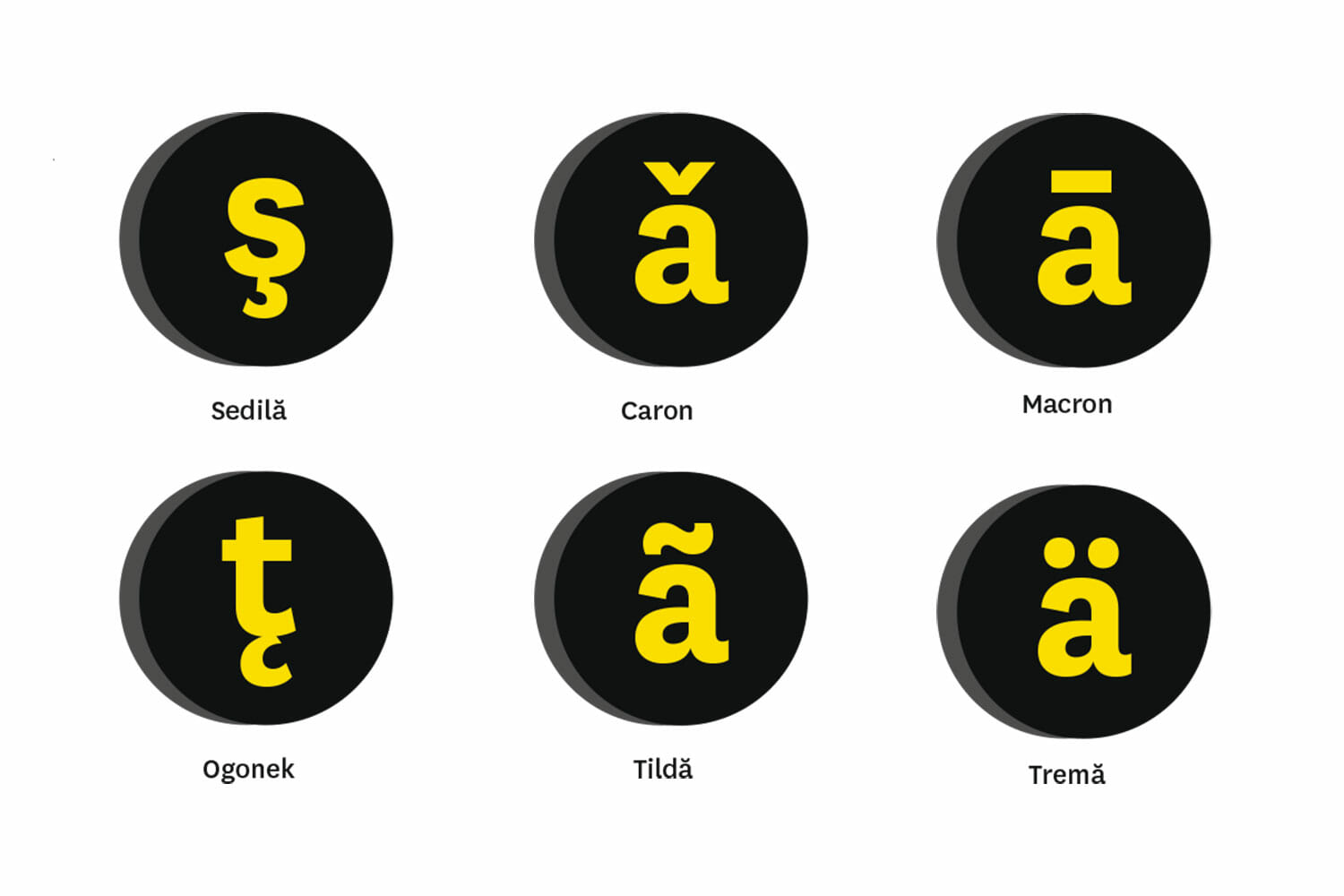
In 2003, the Romanian Academy officially declared: In Romanian language, the correct quotation marks are like „this”. And the letters ş and ţ are marked with diacritical marks shaped as commas, not cedillas. The second specification was critical: the entire evolution of the digital writing of Romanian was determined by the case of ş and ţ.
Titu Maiorescu and the orthographies from the beginning of the 20th century claimed that below ş and ţ stands a cedilla. Because, back then, printers had limited resources, the theory didn’t exactly match practice and characters were graphically represented either with a cedilla or with a comma. In 1909, Convorbiri literare magazine (Literary Conversations) was written with cedillas, and Luceafărul with commas. In time, commas became common place. “The Romanian Language Dictionary” in 1910 is written with ş and ţ with commas, and so are “The Orthographic and Orthoepic Guidebook” from 1965 and “DOOM I” from 1982. Yet none of these works clarifies the transformation of the cedilla into a comma.
The statement made by the Academy in 2003 – and restated in 2005 in “DOOM 2” – was the first official certification of the commas. Vintilă Rădulescu, who coordinated the work on the dictionary, explained in an email: “In the typographical and didactical practice, the use of the comma is lost in the time immemorial. There was no decision, no argument, just the acknowledgement and the explication of a reality.” As for Maiorescu’s cedillas, Vintilă Rădulescu says: “the term sedila (cedilla) was used incorrectly, being at the time, the only term known, as loan word from other languages in which the cedilla is used.”
Indeed, Maiorescu had borrowed the cedilla from French, and he did it on purpose: just as in French, it was to soften the sound marked by the basic letters. Moreover, the sign is based on the Visigoth z and it appeared in the writing of the Old Spanish combined with c in order to mark the sound ţ. Vintilă Rădulescu’s explanation supports the idea that the appropriation of the comma was based on a printing tradition, and not on a linguistic decision.
At present, the cedilla is used in combination with c in French, Catalan, Portuguese and Albanian and with s in Turkish. The diacritical comma is used just in Latvian under the consonants g, k, l, n. The Latvian commas have the same problem as the Romanian ones: they are always being replaced with cedillas.
In handwriting, this diacritical mark never represented a problem. In the first grade, we are taught: breve (hat) on ă, circumflex (or roof) on î and â and comma under ş and ţ. In digital writing, the cedilla and the comma are two things completely different. The treacherousness of the detail consists in its viciousness: it is almost invisible to the naked eye, so the user cannot imagine its effects.
The linguists didn’t think about this. Until they began to write on the computer themselves, says Zafiu, the two worlds were completely separate. The texts went to the publishing houses and it was there that it was decided how the letters looked.
The cedillas under ş and ţ were first certified internationally in 1987 in the set of standard characters adopted by ISO for Eastern Europe. It took ASRO 10 years to request the introduction of the commas for Romanian. In 1998, ISO published an update of the ’87 standard ignoring the request. In 1999, ASRO adopted the first set of standard characters for Romanian (created by the same team responsible for the keyboard) in which ş and ţ had commas. The same year, the Unicode standard defined codes for characters with commas. It was only in 2001 that ISO introduced them, too.
Until the clarification of the standards, the ş and ţ case took a turn for the worse: the pair ş with cedilla and ţ with comma. Since ţ with cedilla doesn’t exist in any alphabet, the letter was mixed up in a variety of numeric and alphanumeric codes, descriptions and instructions – detailed in Kit’s manifesto in 2008 – and it ended up in fonts with a comma. Optically speaking, it is correct. Technically – from the computer’s point of view – it is just like having a cedilla.
The ISO and Unicode standardization of the correct diacritics for Romanian didn’t bring the case of ş and ţ to an end. It was only in 2007 that Microsoft reacted, with Vista. The keyboard setting for Romanian is finally in accordance with the ASRO standard, and the fonts include ş and ţ with comma. People who legally own Windows XP can download an update for four fonts (released thanks to EU’s needs of writing documents in Romanian when Romania became a member state); without this update, documents written with commas in Windows Vista and newer versions cannot be rendered correctly. Apple introduced ş and ţ with commas in 1997, but they were rendered correctly just on Macs and weren’t recognized in Windows.
The solution consists in synchronizing all the mechanisms involved in this mess– operating systems, applications manufacturers, users – and it proves the power of the resistance to correcting a standard once it was incorrectly used. “Fortunately, the migration is, willy-nilly, towards the correct writing,” says Secărică. There are some who argue that it is too complicated to write with diacritics. (Romanian has to be set as local language, you have to change the keyboard from English to Romanian, and learn the position of the characters.) “If you don’t want to, suit yourself. But if you want to, you can,” says Secărică. This is what motivated him in his fight to bring things to a normal state: “I want to be free not to comply, but also to be free to comply.”
The ball is once again in the court of the computer specialists, says Matei. “It is a thing of technical refinement; can you explain to average people that they aren’t writing the ş correctly? They’ll just say that if it isn’t all right like that, they’ll write it with s. I’d just work against diacritics because of my stupidity. And my interest is for them to write correctly.”
Dexonline.ro sets a very good example, being one of the few Romanian sites that uses the correct diacritics, using an application that recognizes in searches all types of ş and ţ.
“The incorrect use of many things, not just of diacritics is a disease,” says Puiu of Re:ply. “We could make something out of nothing and brag about how creative we are. Wouldn’t it be better if we made something out of something and actually make it work?”

In conclusion, the standards are there: breve, circumflex, comma. The technical problems have also been solved, though there is still the argument that it is safer not to use the diacritics or to use the incorrect ones, if you want to make sure that the readers won’t read a text full of empty squares or question marks. It will probably take years until all the applications and operating systems are updated and synchronized. The users, the designers, the programmers, they will all comply with the norms. It is no longer a question of “if” but of “when”.
It’s true, nowadays if you want to write using the correct diacritical marks you have to make an additional effort. And what is the most common reaction when it comes to additional efforts? “Why bother?”
The why-bother mentality was – and continues to be – the main weapon in the massacre of diacritical marks. “We are not strict enough with ourselves,” says Matei, who is now working to impose a Romanian keyboard layout to public institutions. “I don’t care about my language, I use five letters less.”
The Romanian letters marked with diacritics are neither many – the Polish have nine, the Icelanders 10, the Czechs 15 – nor complicated. Maybe it is just because they are so simple that they’ve become so messed up, Secărică jokes bitterly. “I blame it on the nation. We are capable of building an oil drill, but we can’t make a match that lights.”
It is not very troublesome when reading, but it makes a difference when you search in databases or digitized texts. More and more documents are uploaded on the websites of public institutions; digital libraries are expanding, and since the contributions come from different sources, they have to observe the standards. Any deviation means having the access to information restricted. “If instead of ă, it writes a with a tilde, which it often does, I can see it with the naked eye,” says Matei, “But when I search Costică, I can’t find it.”
The problem with norms is that there is no one to have them enforced.
“The CNA (National Audiovisual Council of Romania) is able to give fines because there is a control instrument of the audiovisual,” says Zafiu, who is a member in the team monitoring the use of language. In 2008, CNA sanctioned TVR, OTV, Prima, Antena1 TV stations with fines and public summons for having failed to observe the standards of Romanian language, including not using diacritics – which famous late linguist George Pruteanu described in one of his articles as “a horrible act of unprofessionalism and even graphic retardation.” But the CNA does not intervene if the diacritics are used incorrectly. And what’s more, the publishing houses, the papers, the magazines are private bodies which can write, if it suits them, even with Cyrillic letters. The risk of not making themselves understood is all theirs.
The only ones compelled by law to write according to the most recent edition of the DOOM are the authorities, the public institutions, and notary publics. And even they don’t do it right.
On the site of the Foreign Affairs Ministry, the logo reads Romania instead of România, the Public Health Ministry is called Ministerul Sanatatii Publice instead of Ministerul Sănătaţii Publice. On the site of the Internal Affairs Ministry, the diacritics are completely missing, whereas the Environment Ministry sometimes uses them and sometimes it doesn’t. “The institutions must respect the language, the code, the citizens,” says Zafiu. “The French, too, write texts with mistakes, but on the internet pages of the ministries they never write without accents.”
It is certain that there is no easy way. And having such examples as the Culture and Cults Ministry, whose logo doesn’t have diacritics, the Department of Romanian Language of the University of Bucharest, whose logo doesn’t have diacritics, presidents who address the citizens from a tribune that reads Administratia Prezidentiala instead of Administraţia Prezidenţială, it is clear that the why-bother approach is still the norm.
Acest articol apare și în:

S-ar putea să-ți mai placă:

Ultima soluție în lupta cu o bacterie dificilă: transplantul de fecale
O poveste despre scaunul perfect și despre microbii care ne fac oameni. În lupta cu o baterie dificilă în transplant de fecale.

Mici Victorii Civice: Nu vă supărați
O gașcă de ongiști, programatori și designeri simplifică accesul la informațiile de interes public.
Diacritice: căciuliţă, coif, virguliţă
De unde au apărut diacriticele, cum au devenit obiect de harță lingvistică și tehnologică, de ce nu le folosim corect și de ce avem nevoie de ele.